US Foods Moxe Application + Website Redesign
Redesign of current user experiences and introduction of new features and micro-interactions to overall improve users ability to browse products, create lists, submit orders, calculate inventories, and much more
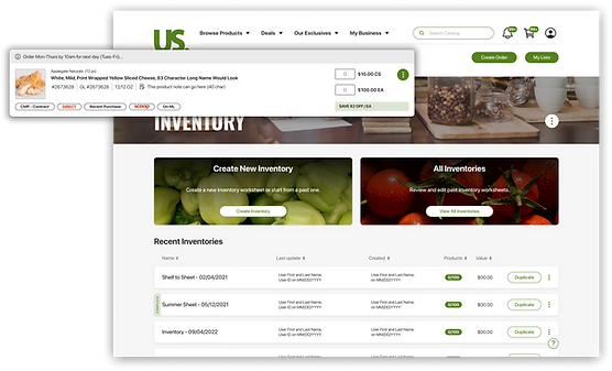
Project Overview
US Foods realized a major opportunity after Covid to redesign their website and introduce MOXē to cater to exclusively online experiences. Since most of their user base may not be deeply familiar with end to end online experiences, it required a balance of sophisticated digital features and ease of use indicators.
Timeline | 1.5 year duration
in July 2021
AGENCY PROJECT
Tools
My Role




Sole UX/UI Designer on this project, responsible for a couple key user experiences. Although most of my work was UI focused, I had to ensure to include UX research and considerations throughout each Journey and Microjourney
PRIORITY USER FLOWS
01.
PRODUCT CARDS
02.
INVENTORY
OUR USERS + MY RESPONSIBILITIES
USERS AND AUDIENCE
Their customer audience include single and multi-unit restaurants, regional chains, national restaurant chains, hospitals, nursing homes, hotels and motels, country clubs and more. Our users tend to be familiar with more traditional methods of wholesale ordering: endless coordination with buyers and sellers, browsing PDFs of products, manually tracking deliveries, tracking inventory, managing costs, many other optimizations on their product orders and decisions.
MY ROLE + RESPONSIBILITIES
-
Lead out on all designs for the features: Lists, Inventory, Product cards and various quick turn designs when needed
-
Examine qualifications for desired user experience and identify gaps and potential improvements for user flow
-
Create variety of designs to review with the product team and developers
-
Provide reasoning for each UI designed to ensure decisions are made with user experience top of mind
-
Adapt final design choice to have all needed screens to encompass the end to end user flow while keeping in mind impact on development
-
Review designs with developers and product owners to ensure we are covering all business requirements as well as optimal UX
-
Ensure that mock ups are included in JIRA tickets 2 sprints ahead of devs for ample time to review any opens or technical questions that may be determined during sprint plannings and backlog refinements
-
Work closely with developers during their sprints to troubleshoot designs and make quick updates to mock up links when needed
-
Adapt workflows to improve the flow from ideation to design to development
-
Reacting quickly to constantly evolving designs as business objectives shift or adapt
-
Know when to push for new feature adoption versus nice to haves that would create more friction for the teams success
-
Manage multiple large design flows and designs being developed in tandem while ensuring delivery on tight design deadlines
-
Communicate effectively with Product owners, UX managers, stakeholders, developers and designers on adjacent teams to ensure unity on all fronts
-
Pay attention to user feedback to identify future enhancements we can make
CHALLENGES

CHALLENGE 1
Upgrading digital experiences while keeping an ease of use for users less familiar with technology

CHALLENGE 2
Considering scenarios where mobile interaction and micro-interactions would be more importnat

CHALLENGE 3
Attention to detail for not just the overall UX feature but all sub journeys or interactions that a user may encounter
01.
PRODUCT CARDS
3 MONTHS
THE ASK
Our scenario was that we had certain messaging that needed to present itself on product cards for various scenarios. I was trying to find the balance between clean alignment at first but as I started designing for all the different scenarios I realized there was a massive opportunity to overhaul the current design to something that optimizes the screen space and makes information more digestible.
The current design had all these elements as separate lines which created a lot of additional white space in moments where little information was filling that space, in mobile this meant cards that took up an obnoxious amount of vertical space. My initial reaction was to find a way where the main content that doesn’t typically change was more consistent across devices, at the same time trying to clean up the organization so that when those variant based elements were not present it would allow the card to easily reduce in vertical height.


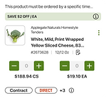
PRODUCT CARD ELEMENTS
US Foods product cards have many different potential variants due to the amount of elements:
Product Information
Deals
Banner
Out of stock with suggestions
Product
Note
Product Pill Identifiers
Quantity
Boxes
Ellipses
Menu
Line # for specific pages
Selector for specific pages
Alert + Notification Messaging
OPTIMIZING PRODUCT CARD DESIGN
I began by exploring what other websites with a large volume of products tend to do when handling product cards with a lot of information. Sites like Amazon, Walmart as well as applications like instacart and amazon Fresh that deal with food products. After pulling my exploration into my file I started iterating, with an initial specific focus on two features: ellipses menu and deals banner.
I was aiming for a clean layout so all the elements were easily readable. The ellipses menu was something I felt was getting lost with all the other text surrounding it. So my first focus was exploring treatments and positioning of this element while also playing around with the deals banner placement.
For the ellipses the key was to make it a more obviously clickable element with ample space to make it easily clickable on smaller devices, while maintaining a spot if deals banner is absent, so the card content would easily adapt to it. Initial exploration looked like this:

SOLIDIFYING THE DESIGN FEATURES
As I iterated I also recognized an opportunity to revisit how we treat the messaging that appears only in specific scenarios. My goal was to come up with a treatment that wasn’t an interruption to the main card content and better presented as a message that they needed to pay attention to.
Insert the tray. Presenting the information in this format would highlight the intended purpose to alert the user that there was something unique about the product, while not getting lost in the content of the product information. This would enable easy variants when it came to different messages and keep a very clean look when presented alongside other product cards.
This really helped solidify the design for the rest of the content in the product cards. It gave more space for other content within the main card and enabled a cleaner alignment while also reducing empty whitespace. While the ellipses menu and alert messaging were two of the main pain points, my main goal was truly to have clean organization that translated to mobile. Not to mention keeping in mind that it was very likely that other elements were anticipated to be added to these product cards (ratings, new promotional banners, page specific treatments).

BUILDING FOR SCALE
After approving the final designs for the product card elements, my focus was to add these into the design system. These product cards are utilized on most user experiences on the website, and tend to have frequent updates. With this in mind, I wanted the product cards to live as a component that could be easily adjusted for specific scenarios as well as quickly editable across all design screens. I knew Figma had a lot of capabilities when it came to toggleable elements within components, but the level of complexity with nested elements the product card presented was new.
I was accounting for 40 variations of these product cards, due to the different screen sizes, page scenarios and card types. Each of these cards have elements that I mentioned in the design process that I needed to be able to easily turn on or off, which ultimately led to creating a series of components that had 13 controllable elements. My biggest challenge with all these variable components was ensuring that the height and organization of the card was able to adapt. But after hours of trial and error I was able to develop a totally customizable component that provided an ideal design tool to utilize across the design team and enable quick updates that push to all frames.
RATINGS + REVIEWS
One of our wishlist items to add to the cards was rating and reviews so that users could easily see other product feedback from first glance at the product card. Our users were keen on including all the current information with the addition of ratings and reviews. So I began to look at how we can best introduce reviews and ratings with minimal impact on the organization we had achieved with the new product cards. My initial exploration was determining whether we should include these on the image to save space or introduce inline with the content for clearer readability. I took time to look at other eCommerce websites to see how they treated placement and followed a couple of those patterns to start with options.
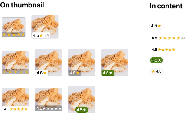
Once I put these designs into the product cards it became clear that presenting it under the thumbnail and reducing the image height maintained the clean and responsive layout. It was determined as well that we wanted to ensure we kept the number of reviews as well as consider what color would translate to the out of stock cards. Since the yellow stars did not pass on the red background on out of stock products I explored a couple options including varying colors for in and out of stock cards but ultimately decided on going with matching both sets of rating stars. With each color exploration I included a accessibility check which ultimately led to our final design of black stars for every instance.

FINAL PRODUCT CARD ADJUSTMENTS
After determining the treatment of ratings and reviews there was one additional item to tackle. There was a desire from our users to not only be able to see the product number but also the General Ledger code. For desktop product cards this wasn't an issue because both numbers were able to fit on the same line, but when we got to smaller screens we found that it began interfering with the note preview when a note was present. Initially I looked at removing the note preview and instead introducing a hover/clickable preview on the note icon, but after some testing and feedback it was determined the note preview must be initially visible. So for those smaller screens I ideated with a drop down to view both the GL code and product number. this enabled users to quickly check either without taking up more real estate on mobile cards. With users satisfied with the updates I could finalize the designs and the final changes could be pushed to production.

COLLABORATING WITH DEVELOPMENT
The need for this design to adapt to various page widths and devices made it even more vital to be closely working with development throughout the development process. These product cards had so many variants that it was important for me to be able to quickly respond to my development team with any questions or specific scenarios we had to solve for. I ensured that I was available to jump on calls when needed and talk through the fringe situations that may require an adjustment to the designs or a different width variation included. Not only was it important to be able to answer to questions but also to take their feedback and recommendations into consideration with the current and future design. This ultimately lead to setting up weekly design and development reviews, this gave me the space to show developers what upcoming designs I was working on as well as provide them a chance to bring up any questions or concerns. I was then able to take any feedback or questions and incorporate it into the designs far before they were finalized and passed into sprints. This helped eliminate so much back and forth that had been happening with previous processes and also strengthened the teamwork between design and dev, and most importantly alleviated both of lives when it came to testing and launches.
SHIFTING FLOWS
02.
INVENTORY
6 MONTHS
THE USER JOURNEY
A larger user experience that I spearheaded all research and design for was the inventory experience. This feature of the website challenged me to juggle multiple designs while ensuring consideration for feasibility for development on a tight deadline. Throughout this particular part of the project my relationship and communication with developers was key. The inventory feature on the website consisted of 6 major user flows and within each of those 7-9 experiences to specifically design for. Once each major design flow was approved, it would move into the next sprint for developers, as I continued work on the other designs to get them prepared for upcoming sprints. I was not only working on multiple user experience designs at once but also closely involved in the working sprints. Ensuring all links for mockups are placed in tickets 4 weeks prior to the sprint to ease backlog grooming and sprint planning, working closely with devs on changing designs based on adjusted objectives, and ensuring to double check live dev environments to see they match with the initial designs.
INVENTORY USER FLOWS
Inventory Entry + Conversion Flow
Create New Inventory
Count + Edit Inventory
Manage Non US Foods
All + Completed Inventories
Printable reports for Inventory Worksheets
ADJUSTING FOR QUICK SPRINTS + DEV COLLABORATION
Once each major design flow was approved, it would move into the next sprint for developers, as I continued work on the other designs to get them prepared for upcoming sprints. I was not only working on multiple user experience designs at once but also closely involved in the working sprints. Ensuring all links for mockups are placed in tickets 4 weeks prior to the sprint to ease backlog grooming and sprint planning, working closely with devs on changing designs based on adjusted objectives, and ensuring to double check live dev environments to see they match with the initial designs.
The goal for Inventory is to provide US Foods customers the ability to calculate all their food costs including products purchased through US Foods as well as external products to give them a holistic view. My initial step was to look into the current experience and identify gaps on how to make this feature of the website streamlined and easy to use, while introducing some newer elements that tie to familiar UX patterns most users are familiar with on major applications.
LANDING PAGE AND CONVERSION FLOW
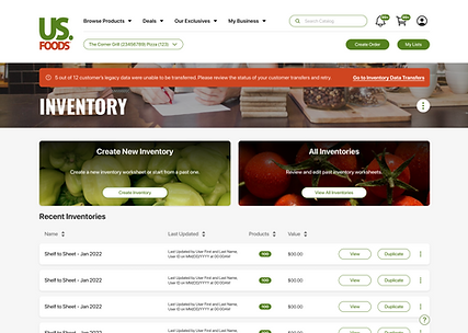
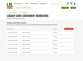
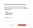
With the initial landing page for inventory I considered two things, what’s the most important information to be presented at a quick glance for inventories and what if a user has never visited the new version of inventories. These new users have been executing their inventories on the previous US Foods platform, so the first action we need to encourage them to do is to transfer their data into the new site. This is the conversion flow and as I started iterations on this design I wanted to focus on messaging. The action of transferring one's data from R3 (old platform) to R4 (new platform) required a lot of checks to ensure that the user understood that if they transferred data, then went back to R3 made changes, a retransfer would wipe anything done in R4.
For this specific experience my iterations for this flow were focused on how to present messaging around this and ensure that users don’t face a situation where they accidentally delete all progress made on R4. The point in the journey that became extremely vital was when a user clicks to re-transfer. I explored other sites to get inspiration for how to handle the deletion of important information. Mailchimp provided a UX that struck me as a very effective way to ensure action isn’t taken with implicit verification from the user. I translated this into my current designs and provided a couple of other iterations along the same line, ultimately landing on one that required users to type “confirm” before the action was able to be submitted. As I went through this research it became apparent to me another gap I saw users would find very valuable. When a user transfers their information a lot of times they have multiple accounts that would be processed, and in certain cases some would fail. I recognized an opportunity to provide a page that enabled users to see details on all their initiated transfers, enabling them to see the status of each. This way if any were failures they have a chance to retry the transfer and eventually provide them support for continued errors for those accounts.
My goal for this user experience was to ensure we provided every user with transparency on how to transfer their data and on the flipside give users who are already active in the platform quick actions to access previous inventories and create new.
CREATE NEW INVENTORY
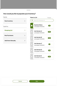
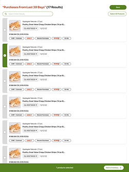
Create new inventory was one of the first user flows to get organized. There was a baseline for this flow that followed a similar pattern to adding products to lists that users utilize to submit orders. And while creating an inventory from scratch was one of the scenarios, we also needed to provide them the option to build inventory worksheets based on previous inventories (if applicable), lists in their account, or past purchases. If users did not have any past inventories to build from in Moxe is when they were prompted to transfer data from legacy or known as our conversion flow.
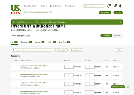
Something that I had to consider with both the past purchases flow and adding products manually was how to treat the presentation of product search. This ultimately lead to the bigger question for our overall design team which was how we treated search in the site architecture. Search was currently being treated as it is its own section of our application so when a user was redirected to search they would be removed from their current experience to be placed into search. For desktop we had been opening new windows with this interaction, but for the mobile experience it wouldn't work and often caused users inability to get back to their previous step in their flow. This initiated the exploration in past purchases to treating the search experience as an overlay for all scenarios. This would alleviate the interruption in not only creating inventories but also building shopping lists, orders and other list modifications. Once a user completes the creation of their inventory and submits it, they will be redirected to their new inventory worksheet with a toast confirming how the worksheet was populated.

COUNT INVENTORY
The count mode for inventory was an overall straightforward design with some many variations to consider for the product cards on this specific page. Product cards on the worksheets enabled users to add a count by case and by unit and based on their entry be able to run calculations on the backend to give them the total value that they have stored. Once an inventory is completed they can select to complete the worksheet and it will then lock in the name and creation date and provide a summary of their inventory. Ultimately giving them the ability to run various reports to compare completed inventories and long term goal of giving them sight into how to optimize their purchasing and highlight suggestions where they can ultimately waste less product.
When an inventory worksheet was toggled to count mode the product cards do not show the selector and some of the fields change to provide the most relevant information for the counting their inventory. There was a large focus for mobile on the inventory worksheet specifically due to the user research that most of the time a user would be entering inventory counts on a mobile device while in their pantries or freezers. That meant ensuring each version of this experiences product cards provided all the information needed on every screen size.


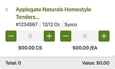
Due to the varying state of each product information and they information needed for an inventory, I had to consider outlier scenarios for certain elements on the card. Providing visual indicators that can quickly indicate to a user if something differs for each product. Where this became most tricky was on smaller screens. We wanted to ensure that not only a visual indicator was present but also we provided context as to why it was being presented. With mobile devices, the ability to hover to show context so I needed another interaction to indicate to users they can learn more about what it means. The two situations were for price overrides as well as if there was an error in calculating the price.
EDIT INVENTORY
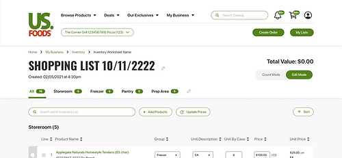
One of the newer features we wanted to introduce with Inventory was the ability to easily toggle between the count and edit mode for each specific inventory. Users would typically be utilizing these inventory sheets as a tracker so they are able to count and calculate all the costs associated with that specific list. Another anticipation was that users would most likely be editing some of these as they go or adjusting new inventories when needed.
I inherited some designs that showed the idea of this toggle for count to edit mode, and as I began building out the frames more in depth one of the main things I noticed was that when a user switched to edit mode they still had to navigate a lot of times through a “manage” button to access edit actions. As I iterated on these designs I immediately thought of tools like square space and LinkedIn and how they do their native editing. I pulled some examples from my research and started playing around with what it could look like within these inventory worksheets. My thought process was that if a user has entered the edit mode, they should be able to easily, and immediately, start editing things. I loved this idea of just adding little indicators to which elements were editable and keep that process in the page without taking them to multiple modals. As I designed it made sense to me to utilize the pencil icon and other common indicators to help users easily adjust things like Title, group names, add/subtract groups. The other feature I really wanted to introduce here was the drag and drop. This was used in a variety of places on the previous site but just for reorganizing group hierarchies, when I saw the opportunity with edit mode to start introducing more common drag and drop interactions seen in today’s UX. This sparked me to dive back into research to find the most applicable drag and drop interactions to introduce in this scenario. There were already elements of drag and drop existing in the previous version of the site, but there was room to make it much more easier to interact with and intuitive. I took examples mainly from Gmail and articles from the Nielson Norman group. Ultimately landing on a design that included the ability to easily drag and drop, with visual indicators with drop zones, change of cursor, and card variations to clearly indicate the action being taken.

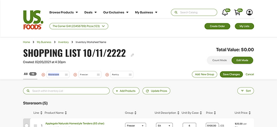

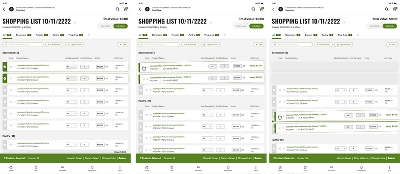
It was important to also provide users the ability to execute these actions drag and drop could do in a more static solution as I took into account that not everyone in the USF user base would be familiar with the touch based action. Hence the preservation of our bottom bar that provided the same actions plus a few other more detailed ones to ensure a user did not get lost when trying to make changes. As I began to finalize these designs I brought in a couple of my developers to walk through these interactions to discuss feasibility and work through how we could build these with our platform constraints. This was something I aimed to do throughout each of these inventory features, as I find that it’s the best way to ensure development is aware of what’s in the pipeline and to keep me from going out of the box. In previous experience, it was easy to go blue sky thinking and not consider that the lift of a feature with the time constraints may not work. It was key to have a member of all teams involved throughout the approval and design process.
NON USF PRODUCTS
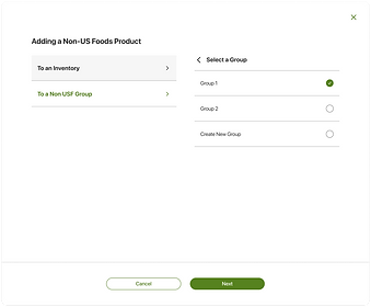
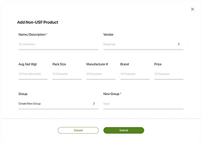
Users would be able to add products manually to any of their inventory worksheets, this included products managed by USF as well as ones that were manually entered by the user. This was to account for the fact that a lot of times they may want to inventory special products that they may receive from a different vendor or provide themselves.
Even though it is not a USF product we wanted to provide users the ability to do an accurate and all encompassing inventory, instead of just inventorying their USF items. In previous designs they could manually add a product but those records lived natively in the specific list they added it to. My approach was to give them a hub to manage their Non USF products so they can easily add them to other lists and inventories. With a future state in mind of enabling users to tag their Non USF items in different ways so they can begin to easily categorize them for future inventories or lists.
My focus for this was to keep it familiar since it would be a new feature. I closely followed the layout and the patterns of our inventory worksheets utilized on the Non USF products page, with the key difference being removing the edit mode. Instead since this is more of a catalog of products, it was designed to have most of the product cards editable items exposed to easily move groups and bulk edit.


With Non US products the product card information also is different from a typical inventory worksheet, this is to enable users to easily differentiate between their other products by comparing similar fields for each. These fields mattered when a user also was looking to add a new Non US Foods product which was another key user flow to be built out for this user experience. I wanted users to not only be able to create new products but also add them to groups within the Non USF page but to inventory worksheets (and in a future state, lists). This would hopefully solve from users having to recreate Non USF products on their inventories, making it easy to manage and reducing redundancy.
ALL + COMPLETED INVENTORIES
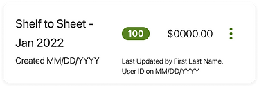
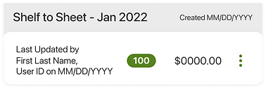
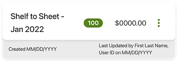
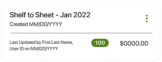
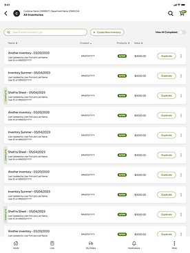
The user experience I needed to design for was a place for users to view all of their inventories, including in progress and completed. This flow introduced a whole new set of cards that gave information on the specific inventory. My focus was to enable users to quickly scan and be able to take quick actions if desired. I hosted a couple user interviews to get an idea of what actions and information users would hope to see when viewing all of their inventories. It was determined that name, last update, date created, number of products counted and value as the information that needed to be presented. As for actions we found duplication would be the first and foremost action so when space allowed I wanted that to be the main CTA and to provide further options behind an ellipses. The combination of all of those elements presented yet another organizational challenge for mobile devices. I had to keep in mind also through these designs we wanted a signifier of completed inventories, which would be design iterations I would visit after iterating on initial Inventory Cards, which looked something like this:

FINAL DESIGN
Next, was to explore the best way to add indicators to these cards when an inventory has been marked as complete. As I begin to explore it was tricky to ensure on smaller screens that the display would not misalign the rest of the information. With this project, final decisions that ultimately get changed was just part of adapting to the environment I designed in. At first iterations I had been given a decision but quickly thought that there needed to be a more clear identifier so that on all devices it was not only clear to see completed but also, enable users to filter down to their completed worksheets.


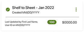
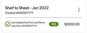

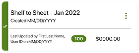
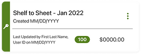
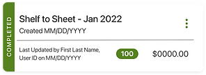
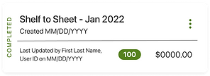
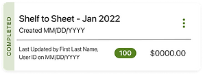
The final choice maintained the text alignment inside the cards to keep a very clean look when all of the variations are stacked on top of each other


PRINTABLE INVENTORY REPORTS
Users are able to run varying reports to convert their inventory data into printable and shareable PDF reports. Due to the volume of information and unique identifiers for specific products, it made previous reports look messy and hard to decipher. I was provided the current state of reports, which consisted of special characters to identify product differentiators as well as cramped lines of varying information. These reports all had to follow similar format so this was my baseline to update the design and aim to make more readable.

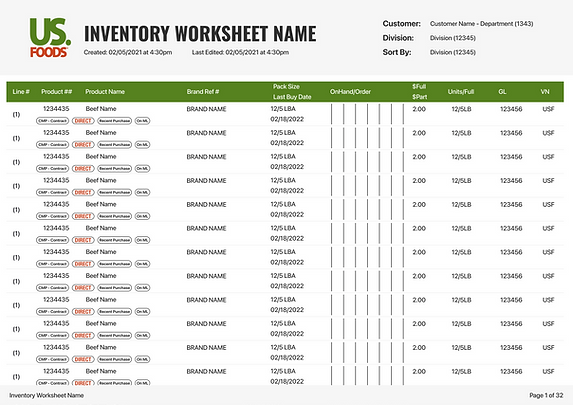
I explored a couple treatments of our "pills" that indicated unique things about products and it was decided to go with this format. This would then would be my template to utilize for any other reports that had slightly different variations for information shown.
OUTCOMES
These user flows were complex, with many micro-flows within them. Through research, team collaboration and lots of iterating I was able to design efficient user interfaces that accounted for every user scenario users may face. While taking into account our unique users and their pain point of adapting traditional processes to an online one, these designs adapt to that specific users need and provides them options. I also was able to introduce more common UX patterns utilized on many different sites to ease users into the massive shift to Moxe application.
This project took attention to detail and preparation for ever changing scenarios. I don't think I finalized any of these user experiences without having some shift in requirements or objectives and having to quickly revisit with live production updates, while maintaining progress on other designs. This required organization and constant communication with developers, as our platform sometimes faced constraints and unforeseen scenarios to account and quickly solve for. The product cards and inventory user experiences were two of my largest user flows that taught me a lot about how to handle such massive and intricate user experiences, but many other smaller flows refined my learnings and developed so much of my UX/UI design knowledge
LEARNINGS
01.
PREPARE FOR CHANGE
This project truly drilled into me that in a fast paced, MVP environment there is no reason to expect final designs to always be final. Due to smaller teams and constant business initiative changes I learned quickly to have things built to easily be able to make changes. Where this became first apparent was my first task with product cards. Components just about saved my life with the changes. Previously the components utilized had been varying and not consistent across teams and screens, which meant changes made in one place rarely made it to all corners, leading to incorrect designs. This was a practice I quickly brought into all other design flows to be able to easily update elements and have them automatically push to all my screens before updating the Zepplin links in the stories for developers to easily reference.
02.
ORGANIZATION AND ESTABLISHMENT OF PROCESSEES
A lot of these user flows were one that I was designing and getting approvals in tandem. Parts of these larger flows were being moved into production sprints so I had to ensure my communication and organization with JIRA tickets and developers was on point. There were also some changing team dynamics that made it difficult at times for me to have all the requirements needed to fulfill the design, sometimes those missing requirements coming at the start of the development sprint, and needing very quick turn designs and approvals. Being the sole designer this required me to try to ideate a solution to stay ahead and leave room for missed requirements or other fire drills. I established the process of ensuring I was 2 sprints ahead of development, that would give me month grace time to ensure all design links were in tickets a month before sprint start. So when we did any backlog refinement or sprint planning there was no question designs were in there. I also began setting up bi-weekly design syncs with multiple developers, this included them more in the process of design and enabled us to flag any questions or concerns earlier on. Our original format was that design decisions were made with stakeholders and other strategy roles, but we found a lot of times our aspirational designs may be leaving out a critical development consideration. All of these process updates made us overall much more efficient and cleared my time of (most) fires, resulting in more refined room for design.
03.
MANAGING WATERFALL DESIGN APPROVALS
This was the first time on a design project that I was solely responsible for 3 massive design flows. It was grueling at the beginning to sort out how to best approach and ensure I had the bandwidth to do proper research, execute good effective designs and ensure user's experience is first priority. There was a lot of turnover throughout the project as well as some gaps in process which at times created a chaotic environment. It became an opportunity for me to step in to bring some calm to the chaos and ultimately I came out a much more confident designer. One that was able to stand up for her decisions when necessary while maintaining quality while prioritizing US Foods objectives. Luckily my stakeholders were always willing to collaborate and trusted my abilities. At every point, I was designing multiple designs at once, typically in a format where when one was getting approved I was wrapping up a couple others to be approved next and so on and so forth. Being the exclusive designer for all things lists, inventory, service request, product cards and suggested products taught me how to step up and out of my role at times, but it ultimately made me a better team player and contributor.
